
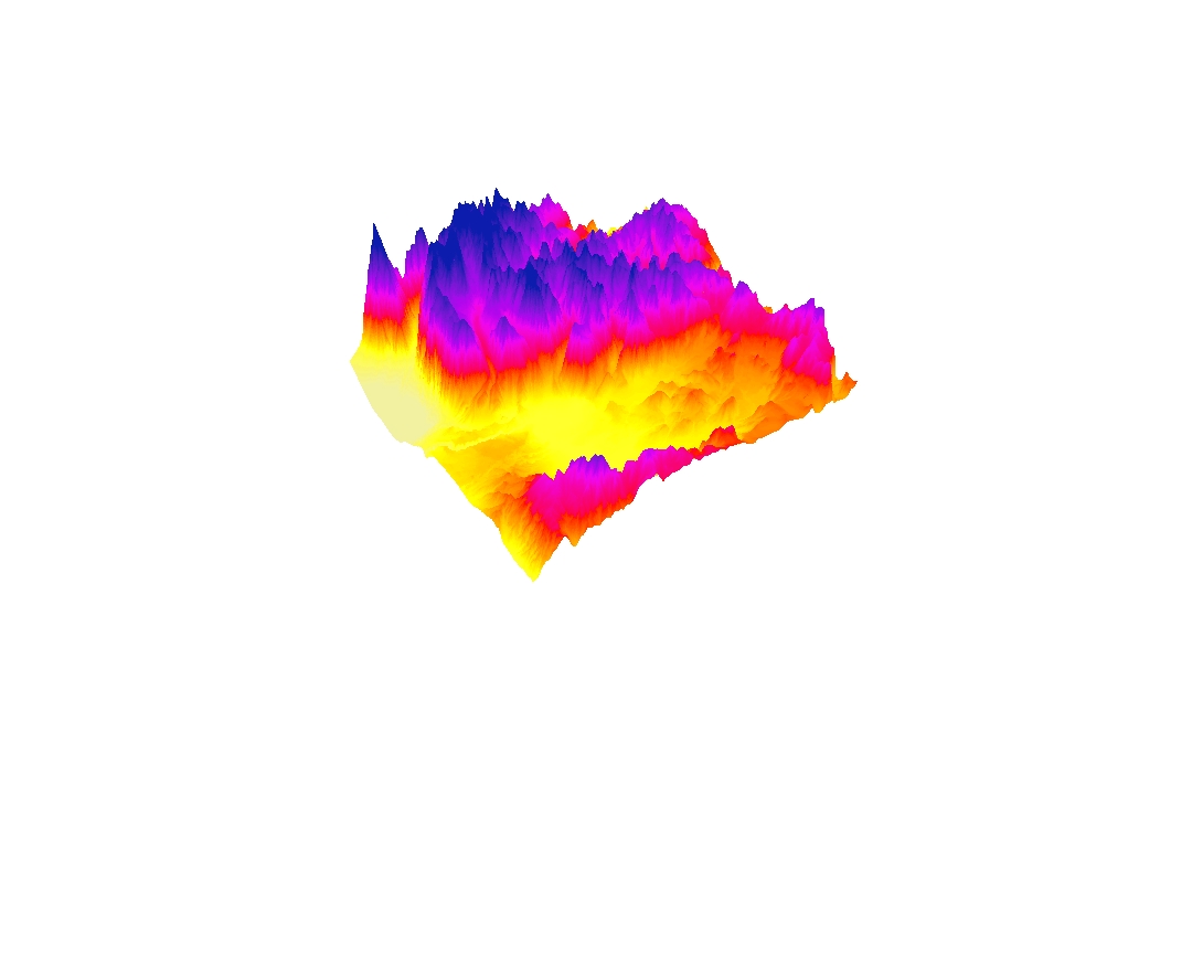
 The LA County Station Fire happened ----. According to an article in the L.A. Times, "The Station Fire is the largest blaze in Los Angeles County's modern history"(Bloomekatz, 2009). Fire Department Captain Jerry Meehan was quoted in the same article that this fire was the largest, hottest, and most-damaging fire he had yet to see (Bloomekatz, 2009). In total, the fire burned 160,577 acres, destroyed 209 structures (including 89 homes) and also killed two firefighters (Wikipedia). However, we all know that a fire effects more than just the things that it burns down. The effects of a fire spread far and wide through the debris in the air and areas surrounding the fire. On the map above, I focused on some major effects of a fire on the lives of those living nearby.
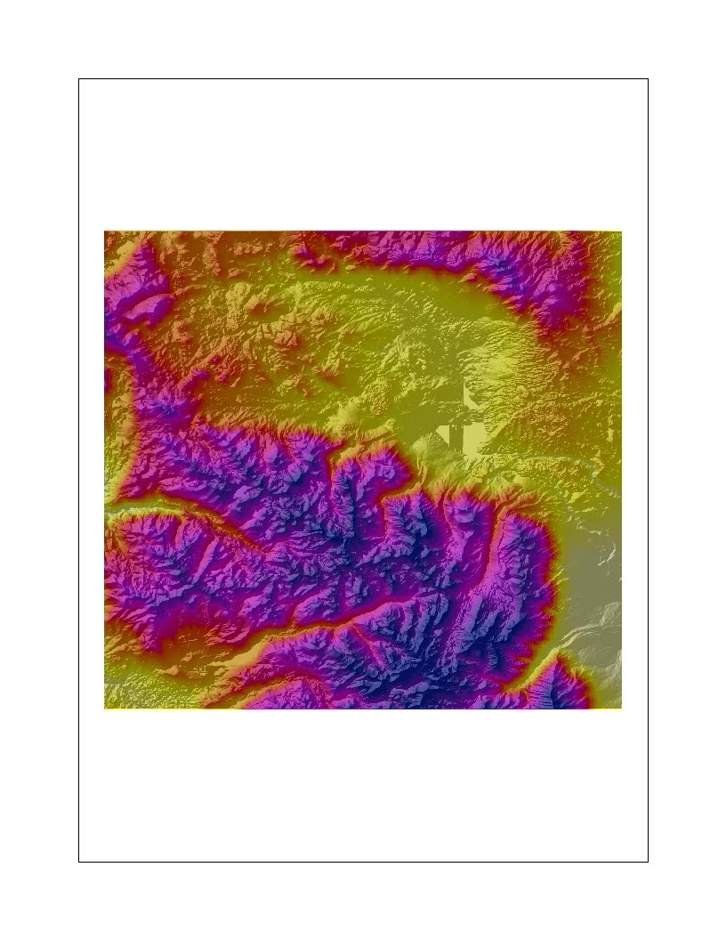
First off, the effect that a fire has on the water sources near it greatly affects the lives of the people in the area. As you can tell from the map, there were many rivers throughout the area that was burned down by the station fire as well as within a 20 mile radius of it. According to an article published by University of Idaho extension, "Wildfire affects streams and rivers in a multitude of ways" (Barkley, 2010). It increases sedimentation, nutrient and temperature changes, and large woody debris can have its own changes on the stream environment as well. Damaging a county's water supply can be extremely detrimental to the people who depend on that water for everyday use.
Another way that a fire can affect the lives of the people living in the area is by polluting the surrounding air with smoke and debris. This is especially detrimental to those in the surrounding hospitals. During the time of the fire, the air quality ranged from moderate to hazardous in the affected area. It would make sense to assume that patients in hospitals nearby the fire (within the 10 mile buffer) were heavily affected by the fire's impact of the air quality. A weak immune system paired with smokey air does not usually lead to good circumstances. According to an article by Gye Young Park, "[Fire] smoke inhalation has a prolonged, negative effect on pulmonary function. The immediate change in the airway after smoke inhalation is an intense inflammatory reaction" (2002). There were 19 total hospitals (see above) within the 10-mile buffer zone of the station fire perimeter on the fifth day of the fire, which was September 2nd. Of those 19, two hospitals were extremely close and they may have been evacuated. While homes may have been evacuated, evacuating a hospital is an even greater ordeal because of all the special life support units that people need.
A third example of the impact of a wildfire on the lives of the people in the surrounding area is the effect of the debris and air quality on the recreation areas nearby. For example, Dodger's Stadium, which is located just outside the border of the 10-mile buffer, was at the end of its baseball season during the time of the fire. While none of the games needed to be cancelled, there was a possibility that they would have to be delayed if the fire continued to grow. Additionally, the LA Zoo, which is located within the 10-mile radius, is a generally outdoor facility. The debris and air quality most likely affected the zoo animals in a variety of different harmful ways. According to the L.A. Times blog, volunteers arrived with pick-up trucks on August 30th to evacuate the hundreds of exotic animals at the Wildlife Waystation in Little Tujanga Canyon, which was "no simple task" (Pierce & Barnett, 2009).
Overall, the point here is that a wildfire has an impact on the lives of people at a much larger extent than may meet the eye. The smokey air and debris can really affect the way people live during the fire as well as days after the fire. While evacuation centers may be set up, the interruption that evacuation can have on a person's life is in itself difficult. Wildfires affect so many little things. I remember being on the tennis team in my junior year of high school when there was a large wildfire in the nearby area and we could not have tennis practice for over a week. The most unfortunate thing about the 2009 Station Fire is that it is thought to have been deliberately started by a person.
References:
1) Barkley, Y. (2010). Wildfire and its effects on streams and rivers. Retrieved from http://www.extension.org/pages/Wildfire_and_Its_Effects_on_Streams_and_Rivers
2) Bloomekatz, A. B. (2009, Sept. 2). Station Fire is Largest in La County's Modern History. Los Angeles Times. Retrieved from "http://latimesblogs.latimes.com/lanow/2009/09/station-fire-is-largest-in-la-countyhistory.html">http://latimesblogs.latimes.com/lanow/2009/09/station-fire-is-largest-in-la-county-history.html
3) California Environmental Protection Agency. (2009). Fire Response and Recovery. Retrieved from http://www.calepa.ca.gov/Disaster/Fire/
4) Park, G. Y. et al. (2003). Prolonged Airway and Systematic Inflammatory Reactions after smoke inhalation. Chest, 123 (2). doi: 10.1378/chest.123.2.475
5) Pierce T. & Barnett L. (2009, Sept. 1). Wildlife Waystation works to evacuate exotic animals from Little Tujunga Canyon. Los Angeles Time. Retrieved from http://latimesblogs.latimes.com/unleashed/2009/09/animals-waystation-fires.html
6) 2009 California Wildfires. (n.d.). In Wikipedia. Retrieved May 22, 2010, from http://en.wikipedia.org/wiki/2009_California_wildfires


